


Naderi Production
2 HANNERT DE KLEPPBEEM
L-6995 RAMELDANGE


At a technical level, color can be complicated; just see our recent article on sRGB vs Adobe RGB vs ProPhoto RGB. But at an artistic level, it is one of the most important parts of an image, impacting emotions and interest unlike almost any other element of photography. This article introduces the concepts of color and color relationships, including how to use them to take the best possible photographs. How to Use Color in Photography?
The two broad types of color are warm and cool. Warm colors include red, orange, and yellow, while cool colors include green, blue, and violet. The two categories of color have their own moods, and it helps to ask yourself which ones you’re photographing at a given time if you want to optimize how your photos look.
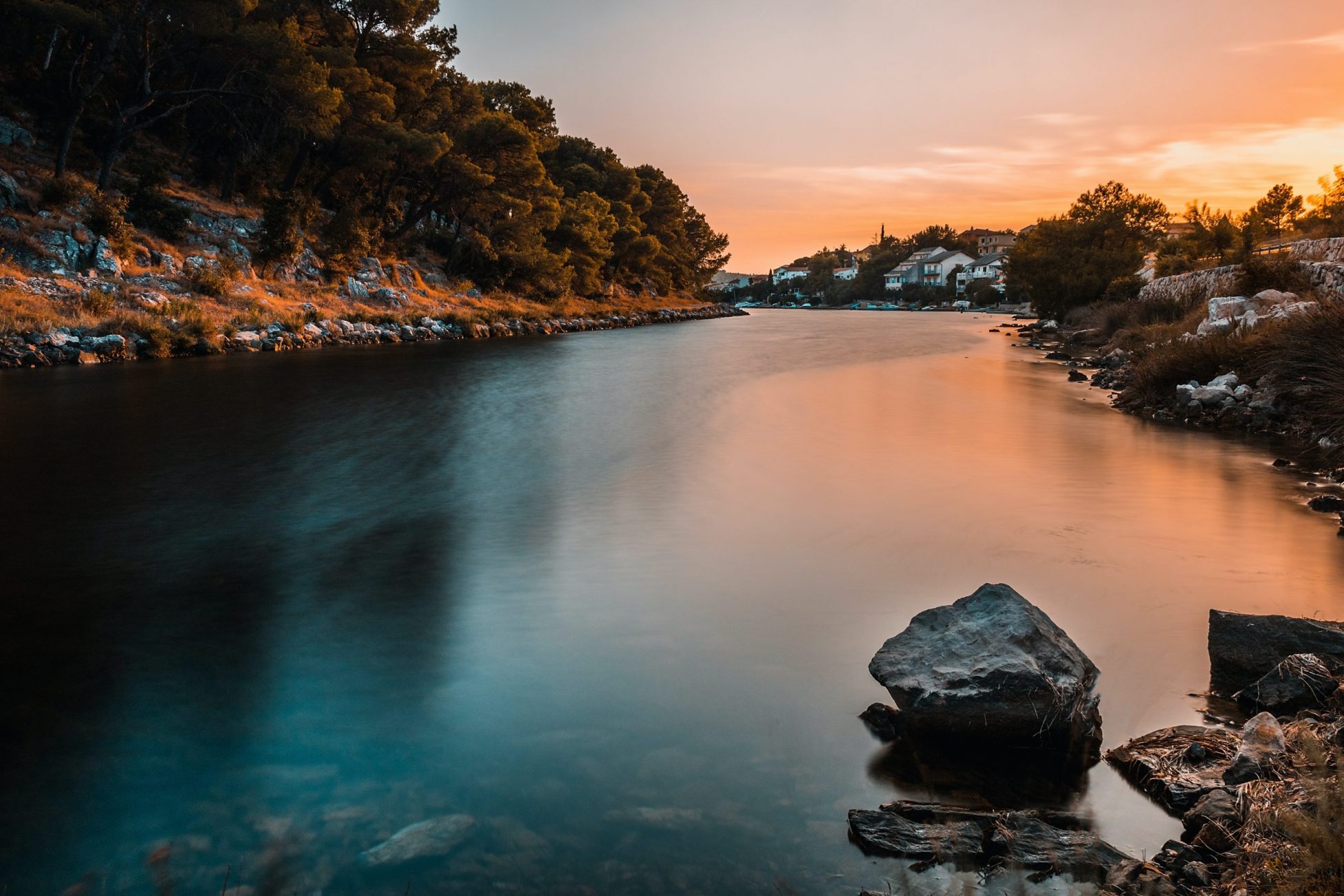
Warm colors are more active and emotionally charged. They jump out at the viewer, attracting attention and drawing interest. In general, warm colors are rarer than cool colors, so an image which has even a small splash of warmth can stand out. This is one reason why photos at sunset and sunrise, as well as fall colors, are as popular as they are.
Cool colors, on the other hand, are more subdued and gentle. They fade into the background, particularly if a warm color appears in the same spot. In general, they don’t attract the same degree of attention as a warm color, though that certainly isn’t a bad thing. Warm colors can be overpowering; cool colors are more likely to appear soothing and calm. Much of nature is made of cool colors, although sunset and sunrise can turn even a blue landscape golden.
Below, I’ll cover each of the six main colors – red, orange, yellow, green, blue, and violet – as well as the emotions that are generally associated with each. Keep in mind that emotion is a tricky part of photography to pin down, and you can take pictures which don’t have the following emotions simply by altering your choice of subject or composition. But the following effects do make a difference.
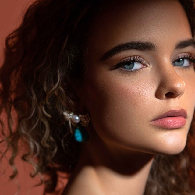
Red is one of the rarest and most powerful colors in nature, red is particularly important to photographers. With the historic associations between the color red and the emotions of passion and excitement, it’s no surprise that this is a very active color. It can also be too intense for certain images; a little red goes a long way.
Compared to the color red, orange is one of the more common in nature. It’s not just sunsets, either. The color brown is typically just a darker shade of orange, and it appears in nature all the time.
Yellow is the brightest and most optimistic color, particularly when it appears on its own and not as a blend with orange or green. However, it is this blended yellow we see most commonly in the world. Even bright green grass and vivid orange sunsets almost always have a component of yellow.
Even though blue is the most common color in nature, thanks to water and sky, green is the one we most associate with life. Our visual systems recognize more shades of green than any other color. So, your photographs can include shades of deep green, vivid green, electric green, dark green, bright green, and almost endless variations thereof.
One of the first people to write about the relationship between color and emotion was Goethe in his 1810 Theory of Colors, in which he said that blue “draws us after it.” Today’s prevailing view isn’t so different. Perhaps this is a case where artistic tradition has overtaken reality, but maybe there’s something to it. After all, blue is associated directly with distance in the real world. Haze on the horizon, as well as the blue sky itself, both signal faraway, even unreachable destinations.
Violet is perhaps the rarest color to see in its pure form in nature, usually found only in very specific sunsets or flowers. Although historically associated with royalty and riches, the color violet in photography takes on many of the same connotations as blue; in fact, it most commonly appears in the world as a mixture with blue, forming a bluish-violet color in the sky or sea.
Color is one of the deepest topics in photography, but it carries emotions so strongly that it is worth trying to think about its characteristics consciously whenever possible. I often find myself working to make a photo as simple and unified as possible, with just a single color that dominates the frame. Or, if conditions are right, looking for a warm-cool split can result in photos that draw a lot of attention, much like shooting with high contrast.
However, the most important part about color at the end of the day is simply what looks good to your eyes. Whether in the field or in post-production, the colors you choose have a major impact on your personal style; some famous photographers have a “look” to their images that’s largely due to their color palette. So, once you understand the fundamentals of color, it’s best to take this information and make it your own.
If you have any questions or feedback, please post your comments in the comments section below.
Naderi Production
2 HANNERT DE KLEPPBEEM
L-6995 RAMELDANGE